Sometimes, the heart of the home actually has a heart of its own.
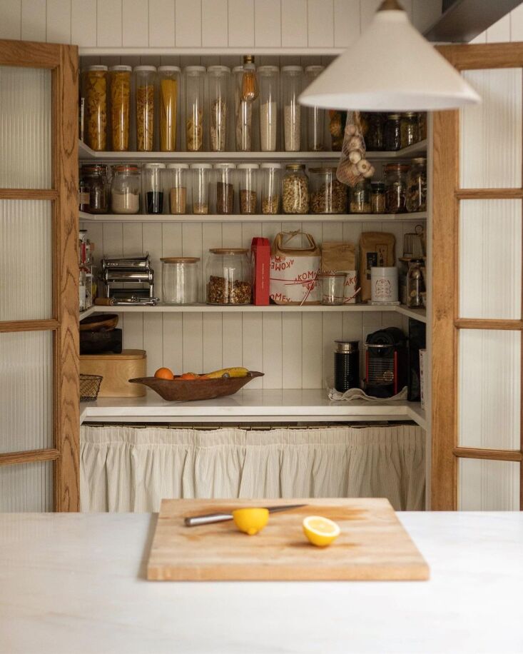
For Italy-born, UK-based graphic designer Martina Casonato, the kitchen was central in the remodel of her North East London home, yes—but a well-designed, well-appointed larder even more so. “Nothing gives me quite the same sense of peace and fulfillment as the sight of a well-stocked pantry,” she says. “For many people, a big American-style fridge is the number one priority in the kitchen. I was more than happy to compromise on the size of ours (which is a fairly modest integrated model, tucked away in a corner) in order to have the pantry of my dreams. It is truly my pride and joy and my happy place.”
It’s also the namesake of the Instagram account, @thevenetianpantry, where Martina started chronicling her remodeling progress during the second phase of lockdowns in winter 2021. The account—with glimpses of the home’s interior and in-depth detail on the process—quickly grew to have 33.5k followers.
Join us for a look at the house as of now, which Martina and her fiancé, Joe, along with firm Bradley VanDerStraeten, have transformed from a stripped-back, architecturally untouched Victorian into a warm, easygoing space—outfitted slowly.
Photography courtesy of Martina Casonato and @thevenetianpantry.

Above: “We started looking for a house together in 2018, after years of sharing a tiny one-bed rental flat in Shoreditch,” Martina says. After searching all through Stoke Newington, they found the Victorian terraced house at the beginning of 2019.
“It was perfect: completely empty, a large tree at the back, white walls and original pine floors and fireplaces. Unlike most of the other properties we had seen, this had never been extended, which made it the perfect blank canvas.” The couple opted to extend the existing galley kitchen (“which was narrow and dingy,” Martina says) with two subtle extensions, which now house the dining room (left) and widen the new kitchen (right).

Above: “From a structural point of view, the main change was the addition of the two rear extensions and doing the loft conversion,” Martina says. “The remaining rooms just saw a light intervention—restoring the old pine floors and a new lick of paint in most cases.”

Above: Martina’s upbringing in Italy and the couple’s work in graphic design (Martina runs London-based Common Kind) informed the plans. In the cook space, Martina “aspired to create a mix between our favorite East London restaurants and an old Italian grandma’s kitchen.” The floor is tiled in Botticino terrazzo from InOpera; Martina designed the museum-like island with glass-fronted compartments, all built by Tekton Joinery.

Above: The couple wanted to create a space where they could cook and entertain: “I had dreamed about having my own kitchen long before we started looking for a house,” says Martina. The cabinetry is also by Tekton Joinery.

Above: “Budget-wise, we chose to play the long game and prioritize good finishes and materials over furniture and decoration,” adds Martina. “To this date, nearly two years after moving in, we are still using our old Ikea sofa!”
“Aside from clearly having a functional purpose, it works brilliantly as a piece of decor in its own right. I designed it with a pair of fluted glass French doors so that I could easily conceal the mess inside, but the truth is we keep it open and in sight 99.9 percent of the time. In the evening, it also works beautifully as a lightbox, thanks to the LED strips concealed under the shelves. The backlit jars create such a cosy and soft atmosphere.”
 Above: The fluted glass doors were custom made by Tekton Joinery based on Martina’s own drawing. “I sourced the pantry skirt from a lady in Italy called Giovanna who has been my mum’s seamstress for the past thirty years!” she adds.
 Above: The expanded kitchen leads into the living area.
 Above: The couple share a neat wall-mounted desk between the kitchen and living spaces.
 Above: The easy-going living room. The pine flooring is all original to the house.
 Above: “We try to take a slow approach to decorating our home, and I like the thought that one day it’ll be filled with pieces that have sentimental value for us—a testament to our shared experiences,” Martina says. (For example? “Our bed (A Gervasoni model from Italy) only arrived after a year of living here.”)
 Above: A writing desk in a bright corner.
 Above: Flowers fill an unused fireplace in the guest bedroom.
“My background in design definitely paved the way for my aesthetic: a certain appreciation for simple forms, clean lines, and a ‘less is more’ approach (in the words of Mies van der Rohe),” says Martina. But I also think a home should feel lived in, welcoming, and warm, which is why I love to mix contemporary pieces with antiques. There is an easy-going quality about these kind of pieces, and I am fascinated by the stories they tell, and the lives they have lived before coming in our possession.”
 Above: The couple added bead board paneling that doubles as a headboard (and a spot to clip a reading light).
 Above: The couple also converted the house’s”loft” into a main bedroom and ensuite, with views of the London skyline. The flooring is new—Whinfell Planks from Tedd Todd—and the loft, like the kitchen, is done in Bauwerk’s Stone lime paint.
 Above: A built-in vanity echoes the design of the home office downstairs.
This was the couple’s first remodel (“and a steep learning curve at that!” Martina says). “Like most first time-renovators, we approached the whole process with a certain degree of naiveté, but were lucky enough to have surrounded ourselves with a team of trustworthy and efficient contractors—we really struck gold there.”
Follow @thevenetianpantry on Instagram for more looks inside Martina and Joe’s home—and, potentially, at their next project: their wedding next year.
And for more houses subtly expanded, see:


